About the project
In 1984, Lanzarote begins receiving massive international flights. Local identity starts to dissolve under a constant flow of visitors. Decades later, the question remains open.
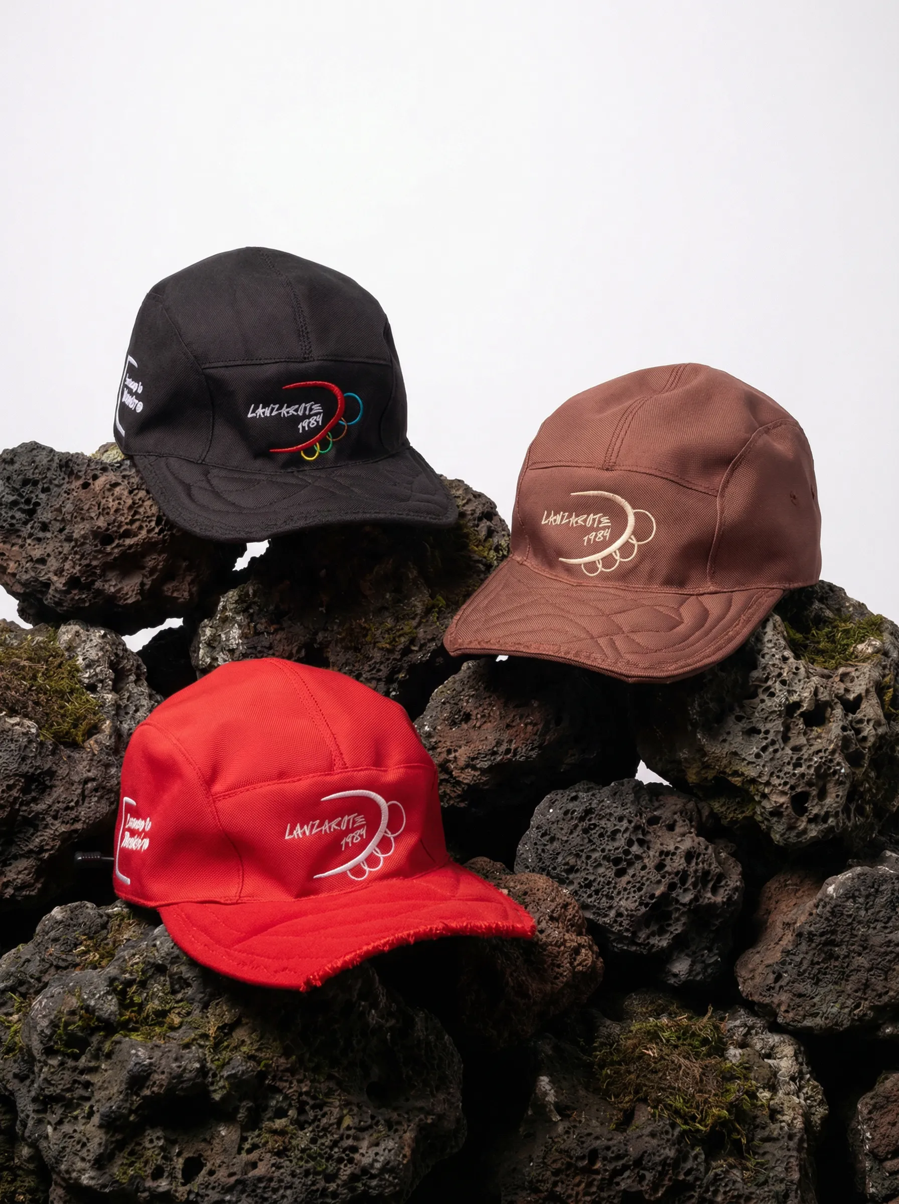
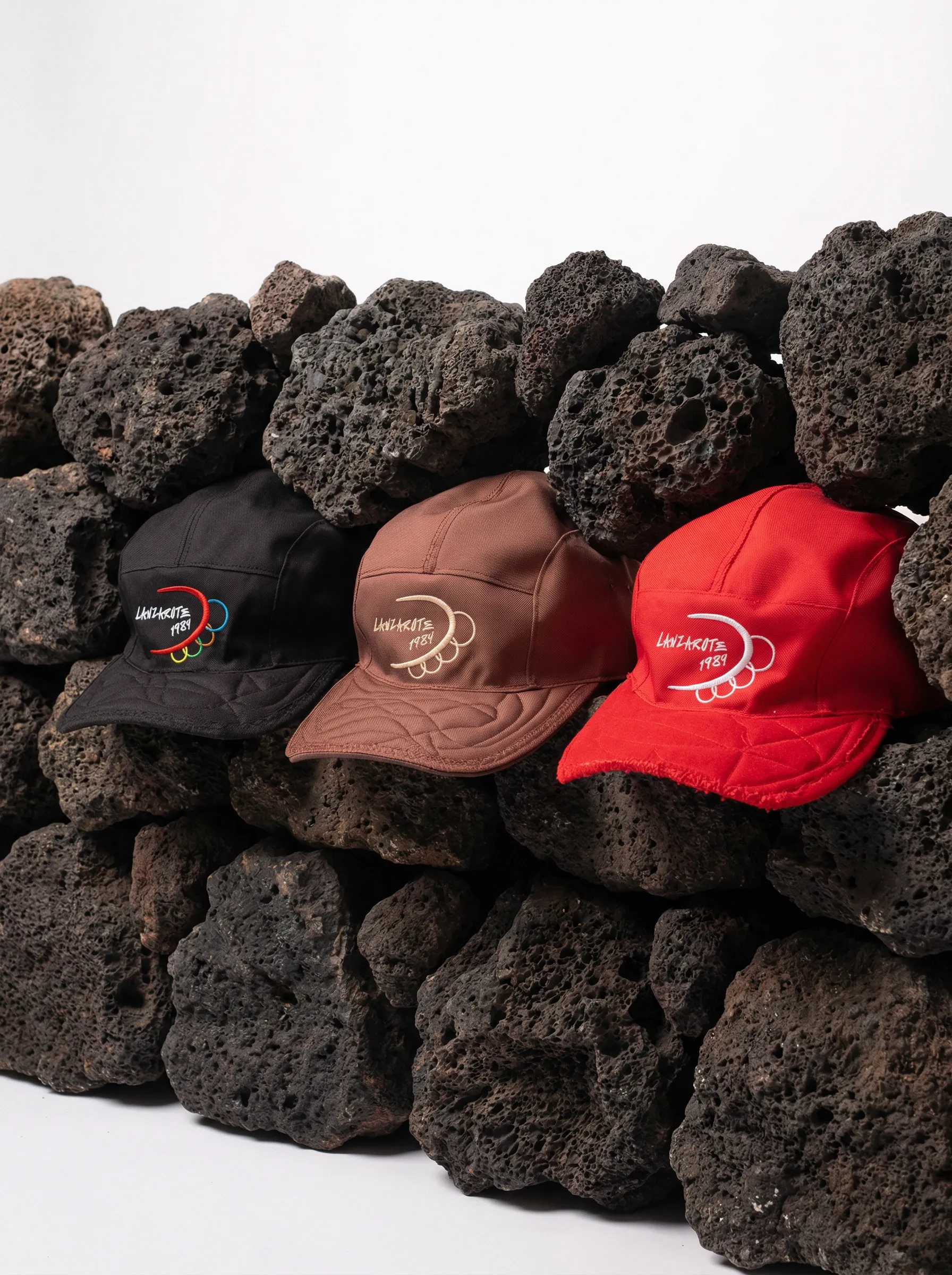
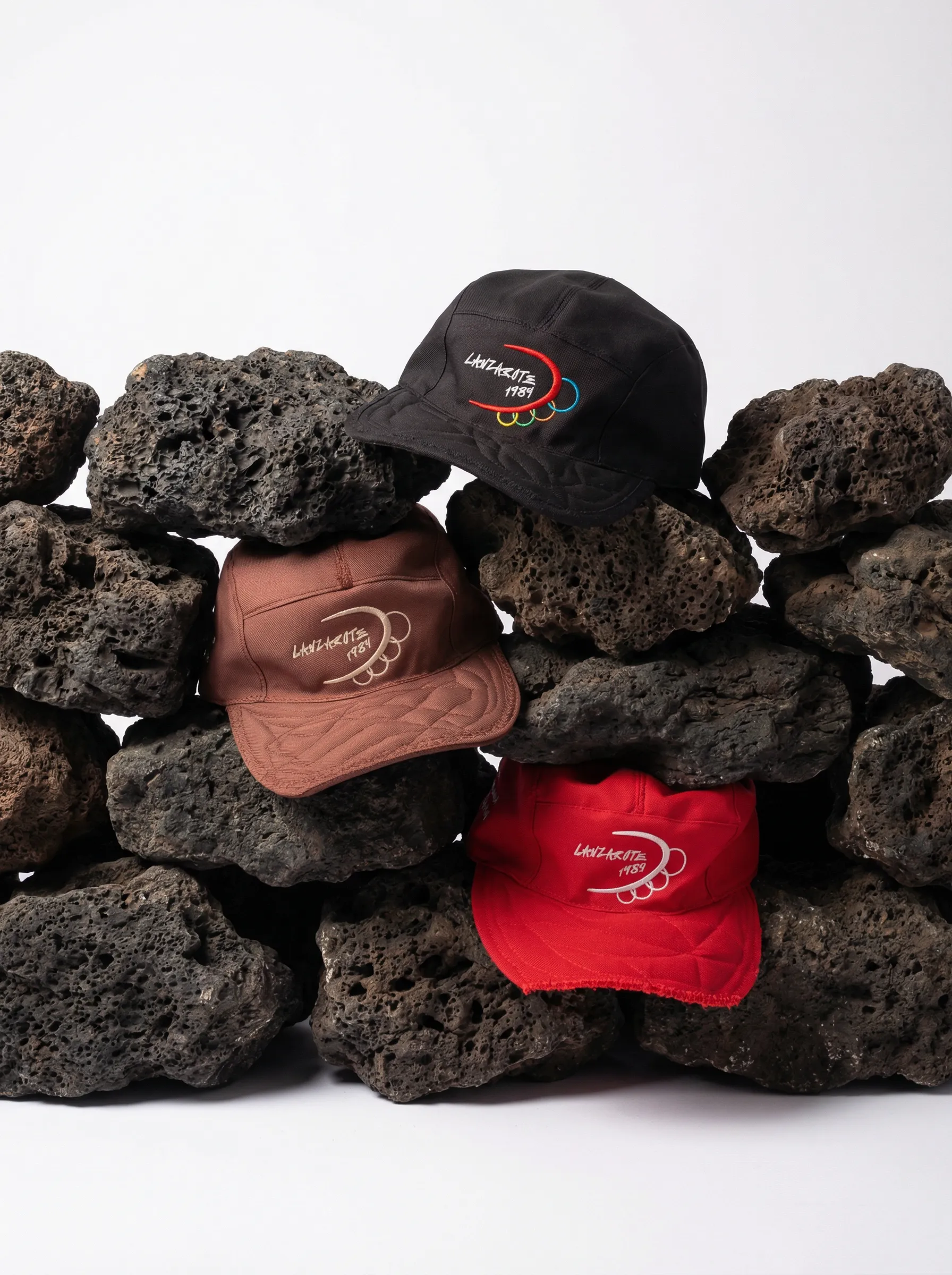
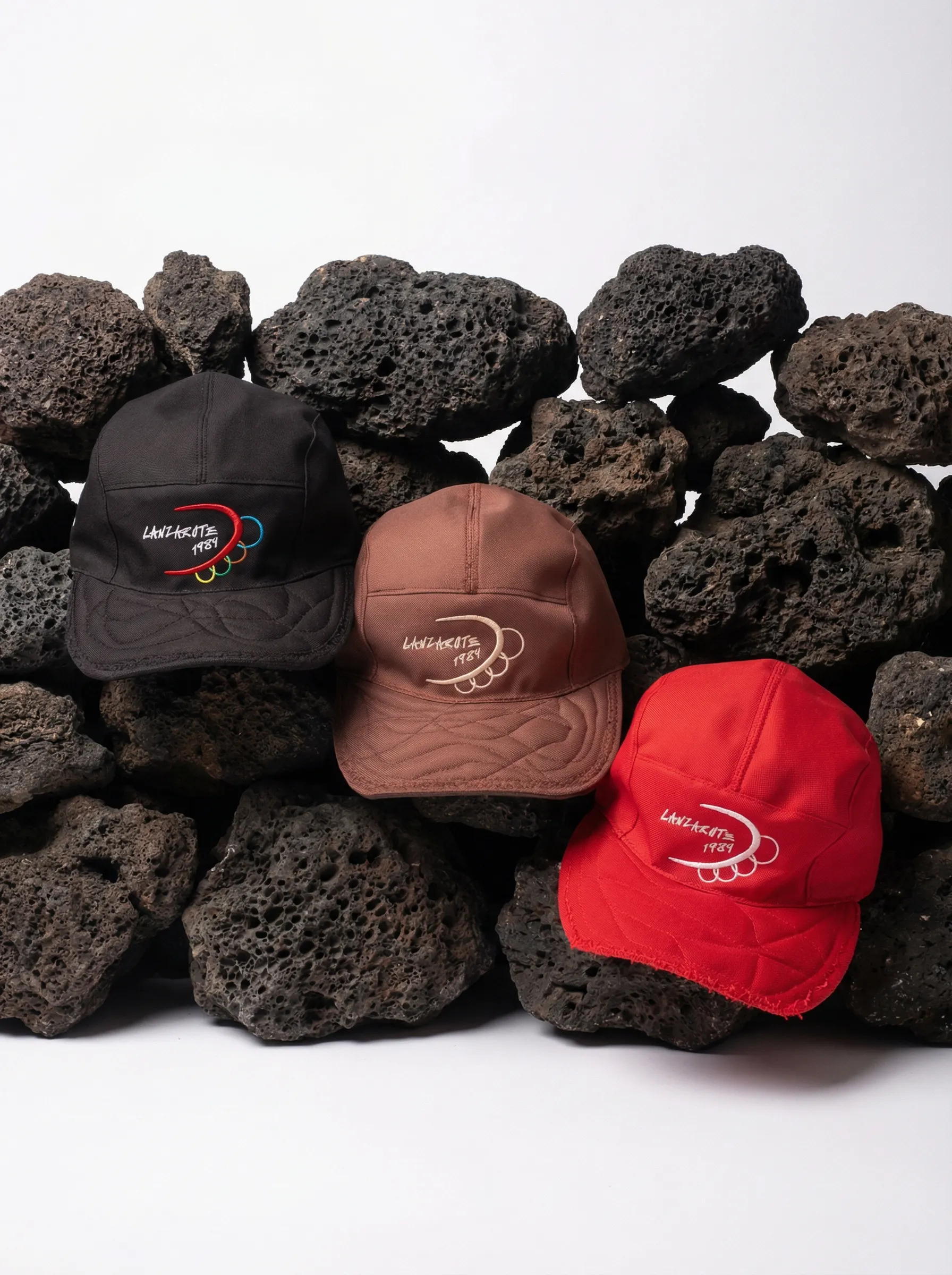
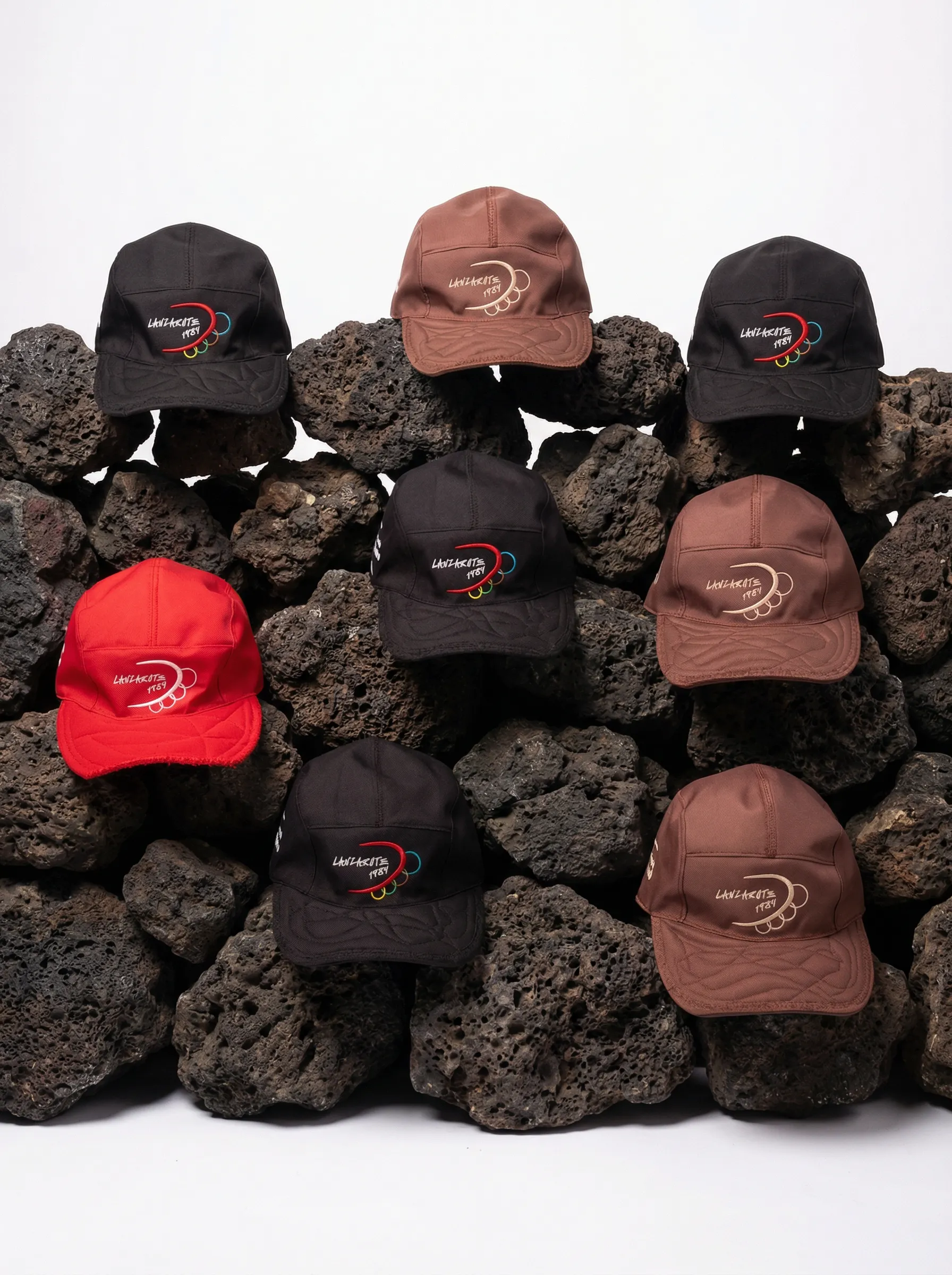
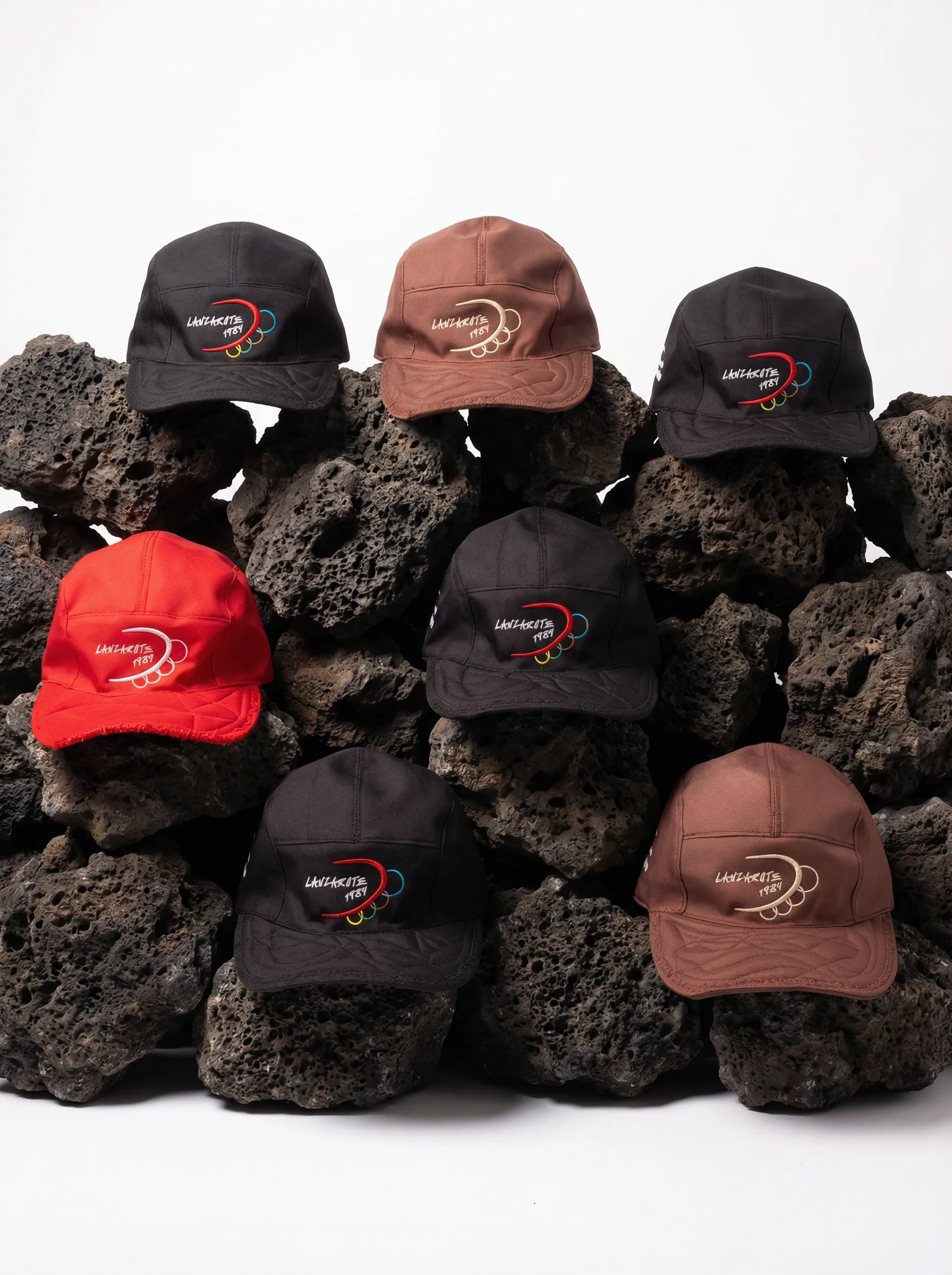
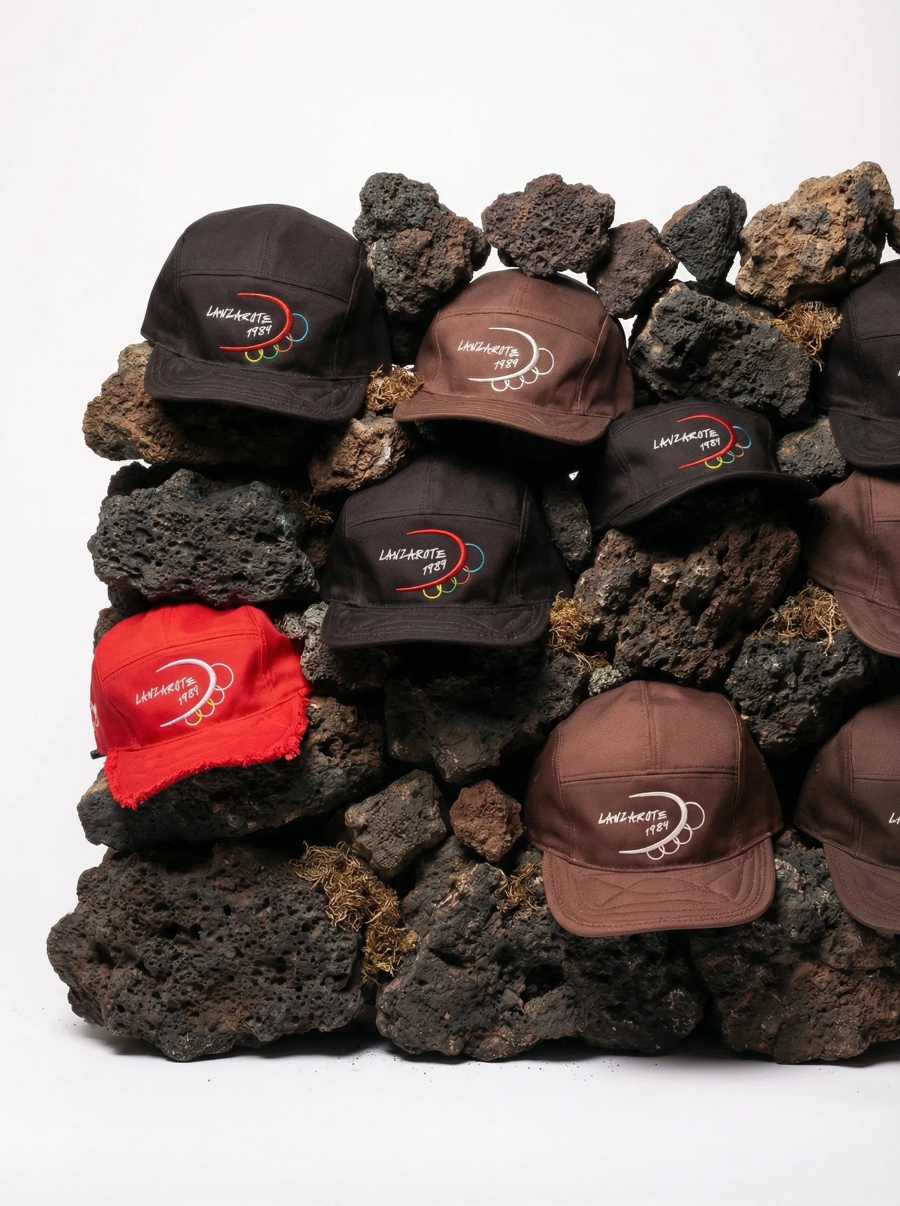
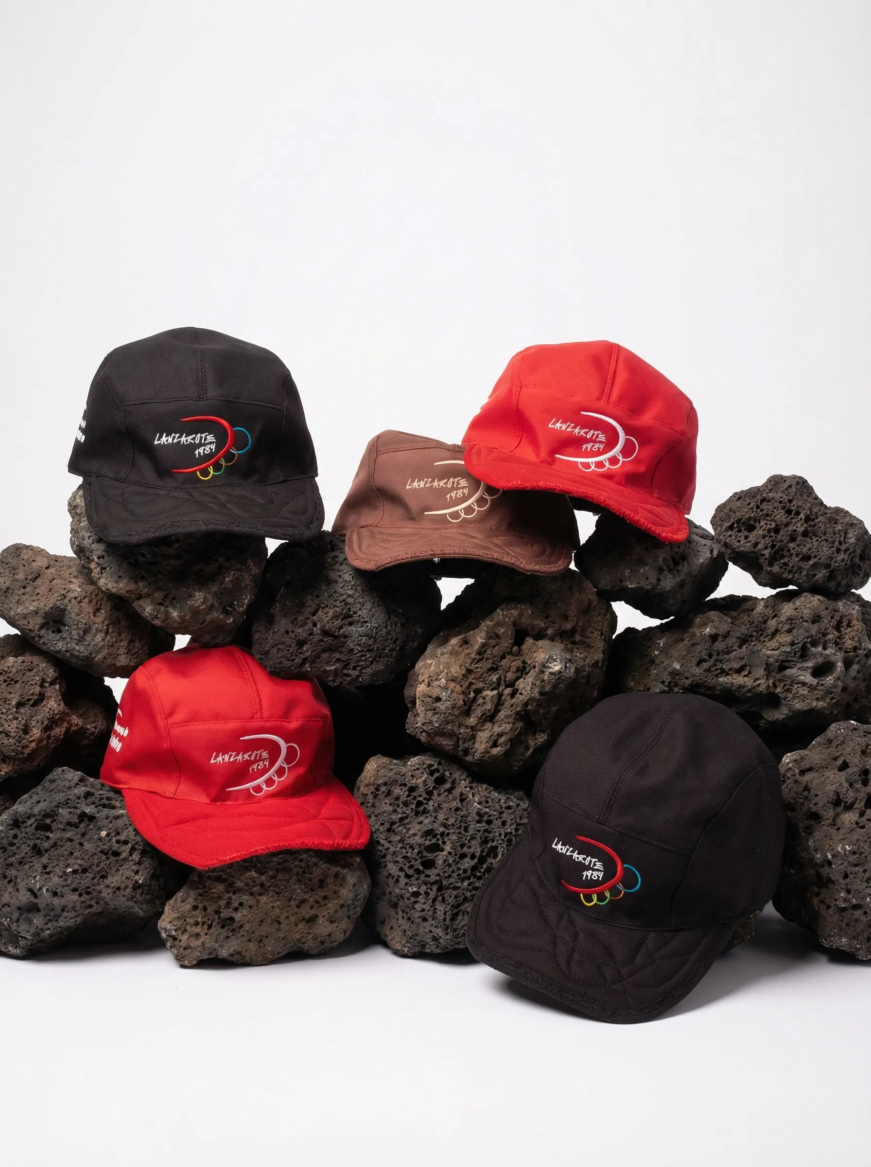
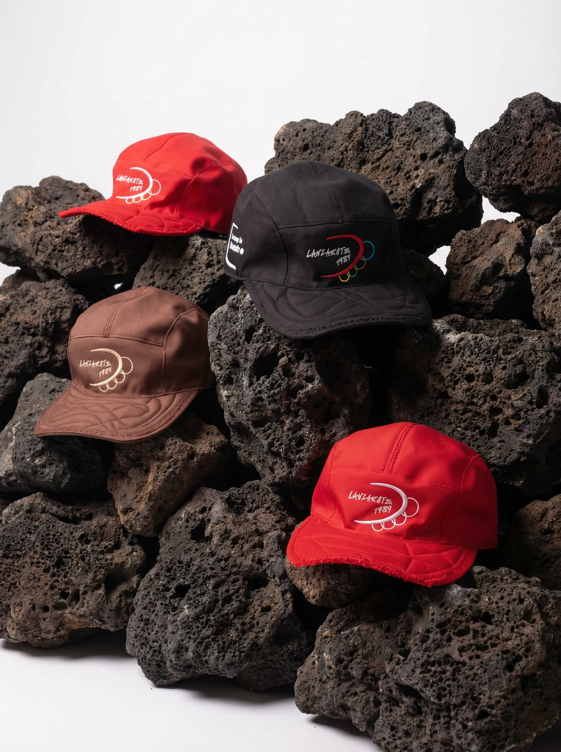
This capsule builds the official merch for a fictional Olympic Games held that year, a visual satire on mass tourism, political openness, and what is lost when a place stops belonging to its people.
Identity
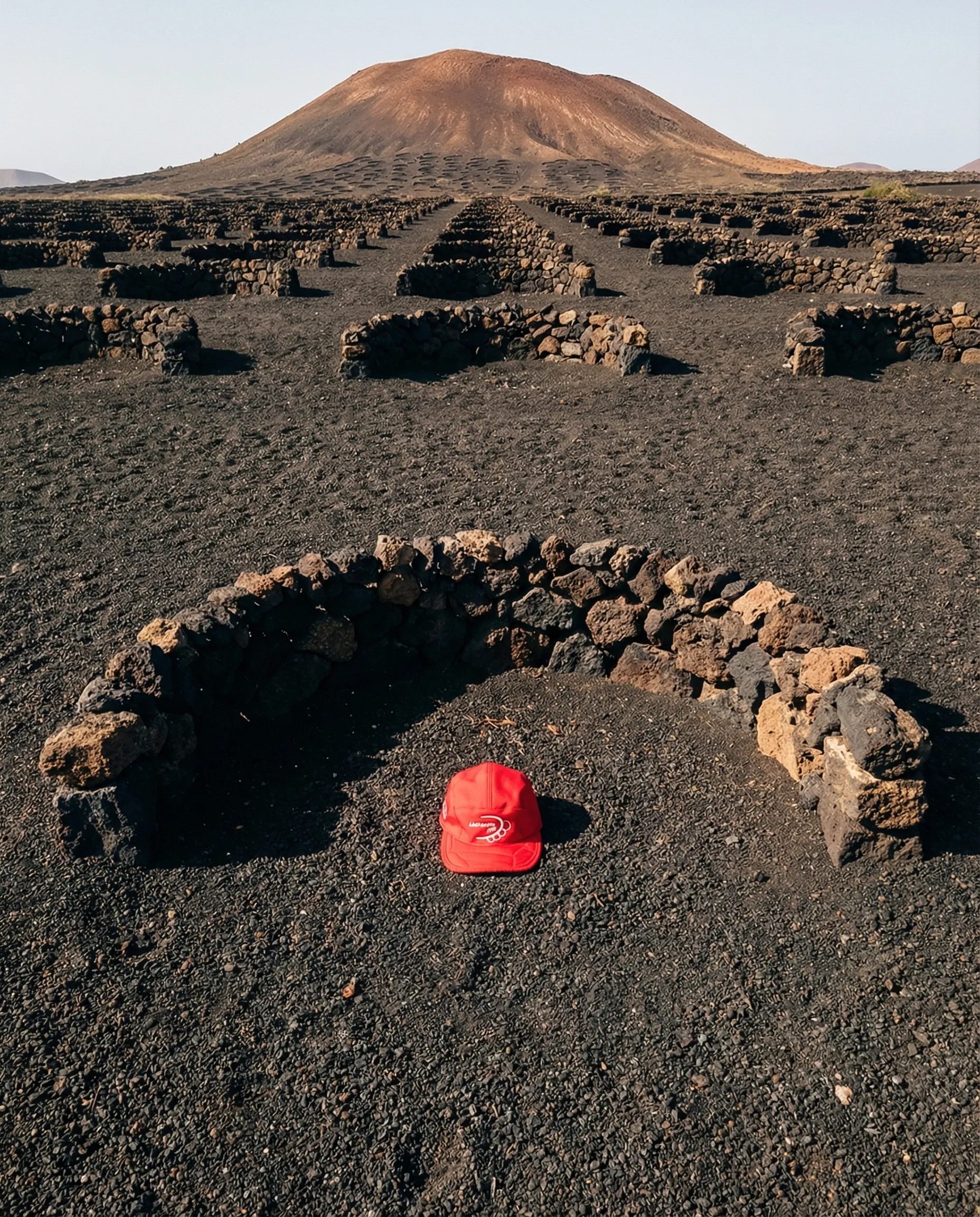
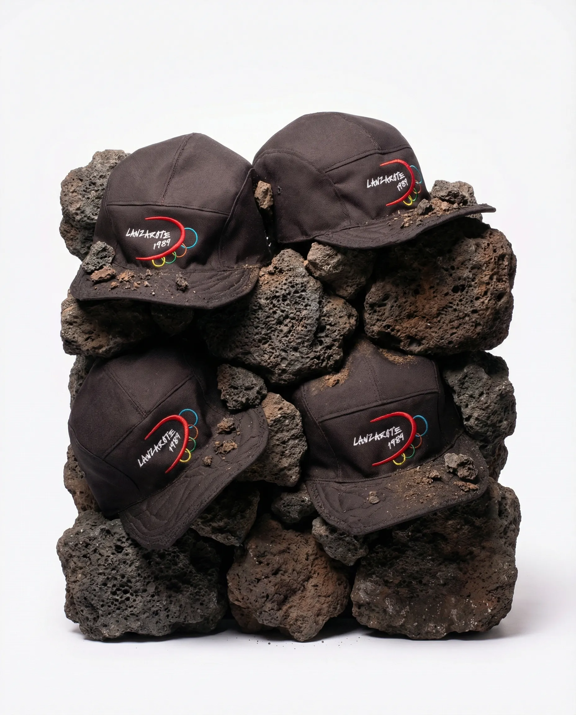
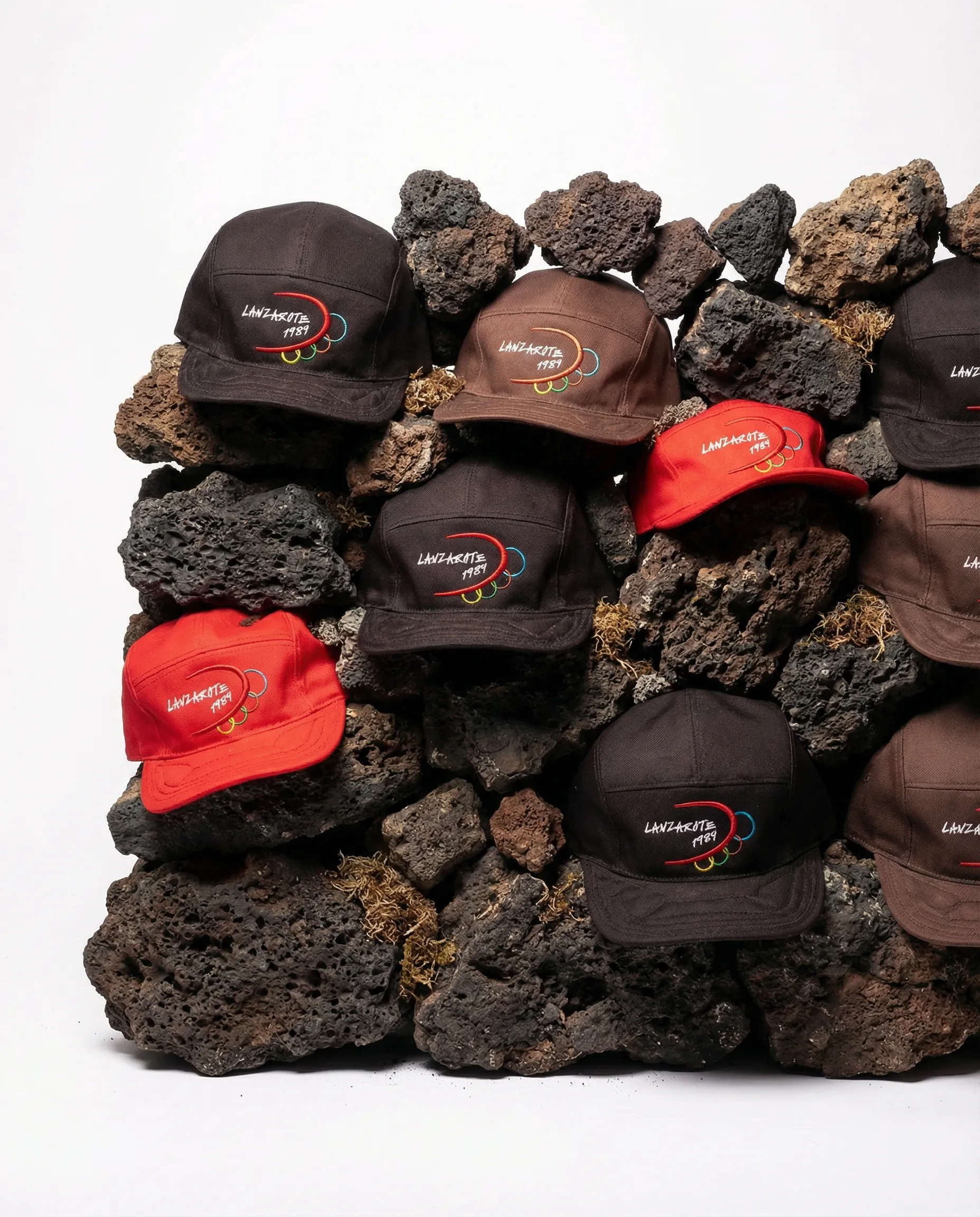
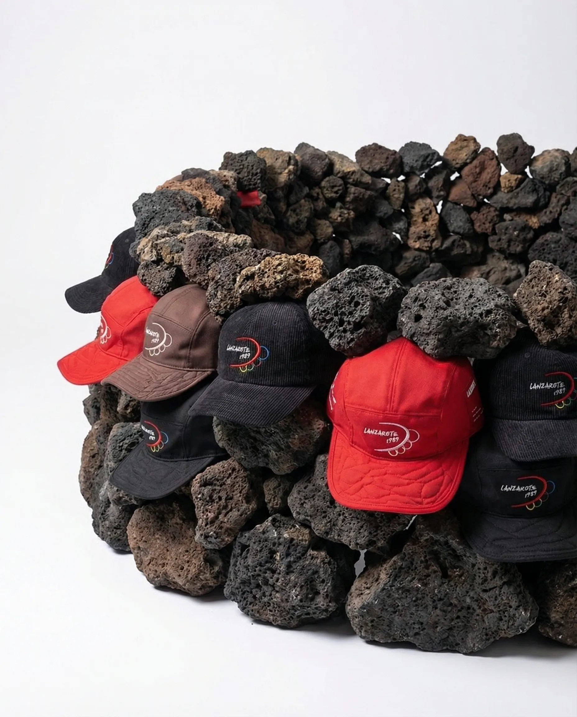
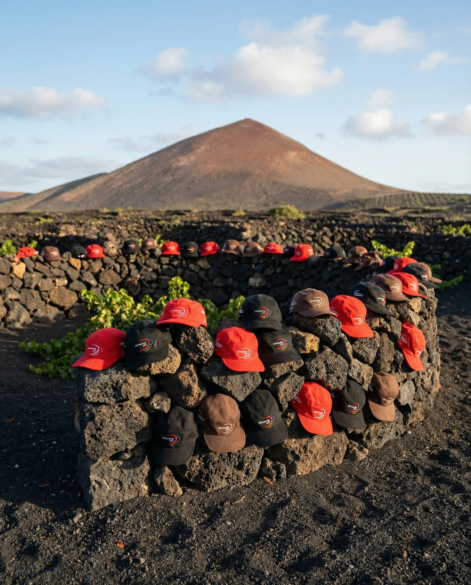
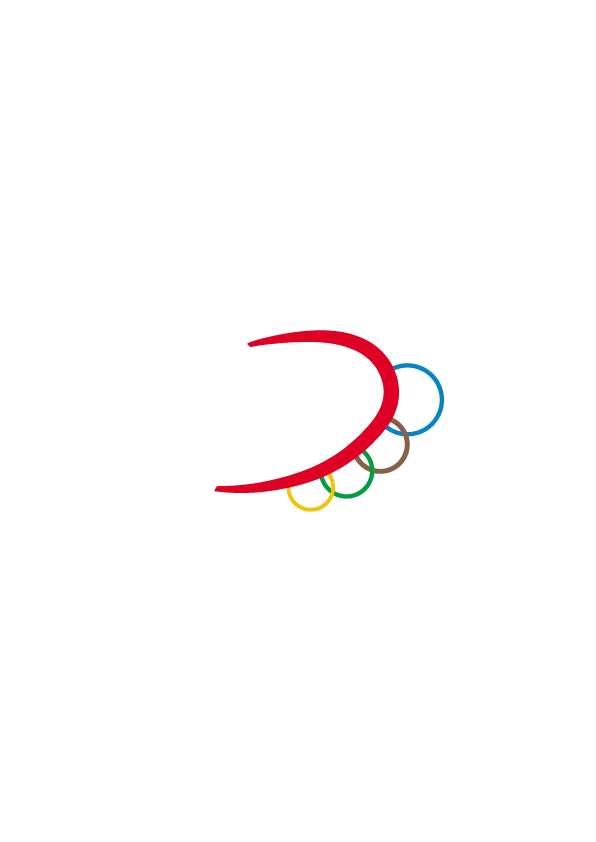
Main logo inspired by the La Geria vineyards and the volcanic stone walls that protect them from the wind. The wall's curvature becomes the isotype's distinctive feature. The rings reinterpret the Olympic ones with the island's own colors, calibrated according to the visual weight each one has in Lanzarote.
In the end, it is the people themselves who protect the land.


Development
To build the visual universe, Olympic Games campaigns from the 70s and 80s were reviewed, setting the aesthetic of official sports merchandising from that era. Typefaces and graphics drawn from old posters of the island.
Palette derived from the colors of the Lanzarote flag: red and blue as a base, brown for the fields, green for the doors of rural houses, yellow for the sun and the sand. The campaign pieces were generated with AI to recreate scenes and atmospheres of something that never existed.