About the project
Five years of Alquemy didn't call for a celebration post. They called for a message. This project starts from scratch with the brand: reinterpreting the logo, multiplying it into fourteen different versions, and building the whole visual universe of the anniversary from there.
The result spans from the main logo reinterpreted in a silver finish with animation to merch, packaging, and pieces for the commemorative event. A coherent visual direction from start to finish: dark, metallic, and with its own character.
Identity
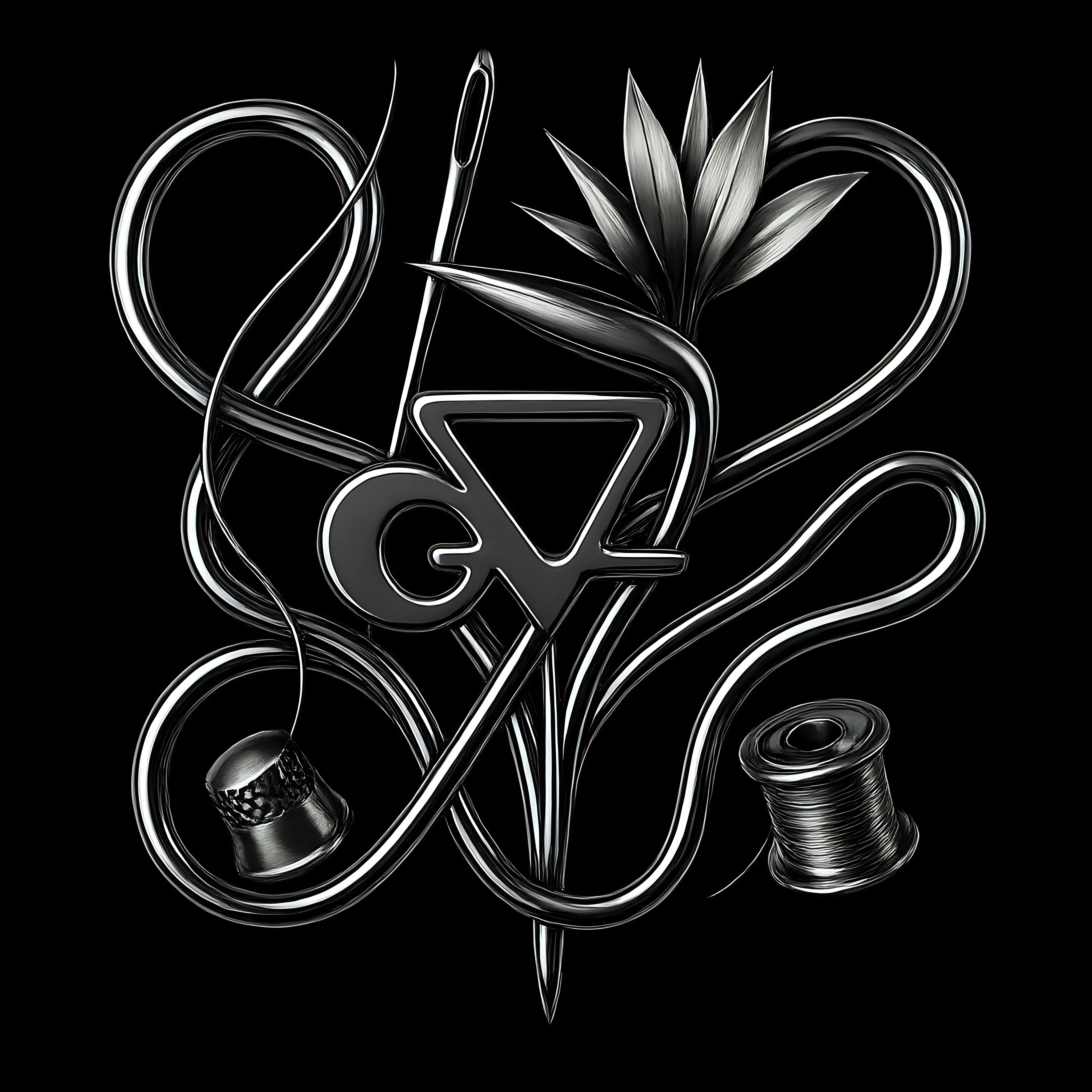
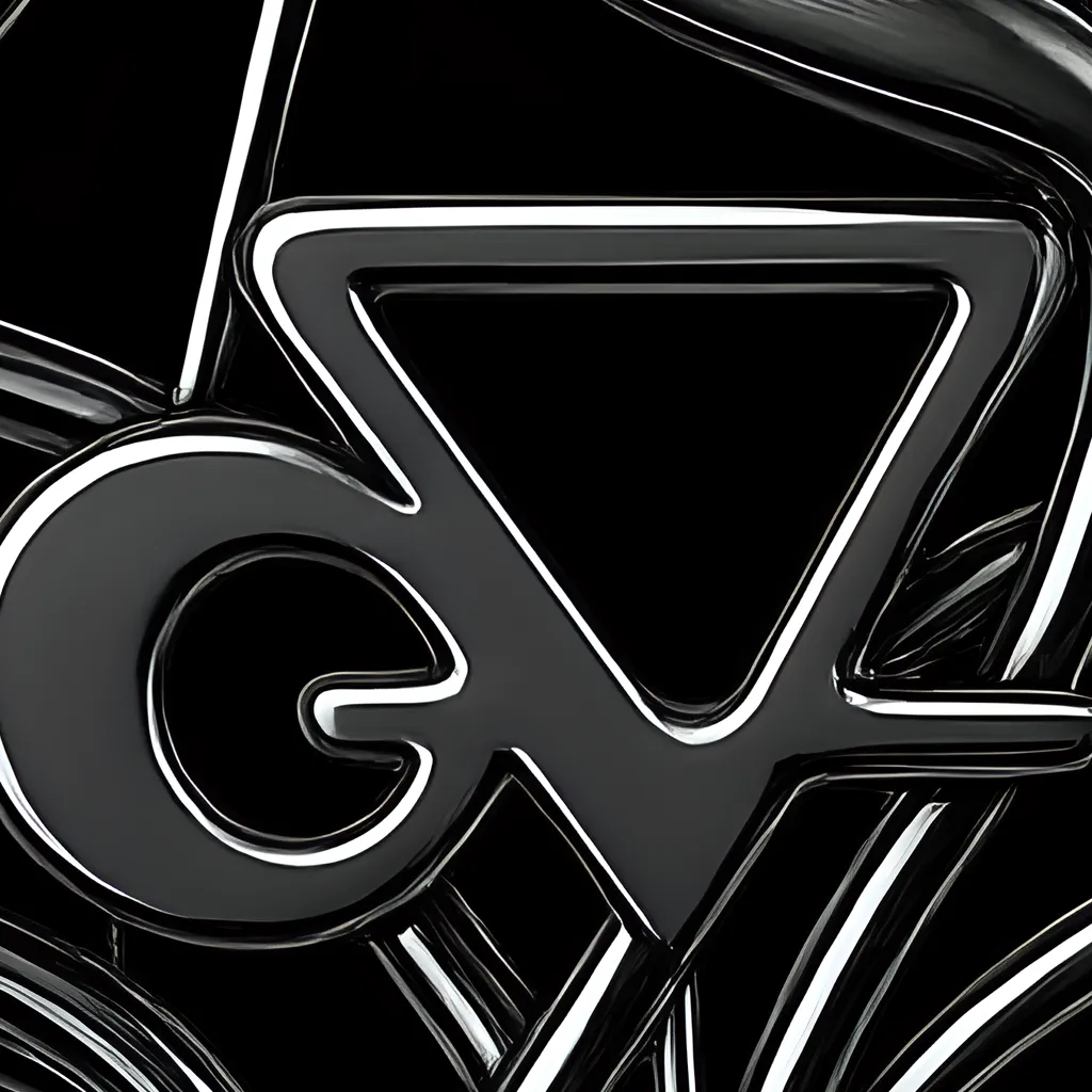
The starting point was the logo. The anniversary version translates it into a silver finish with metallic treatment and an entrance animation, a piece that works just as well on a screen as printed on a garment. Without changing the brand's essence, it changes everything around that essence.
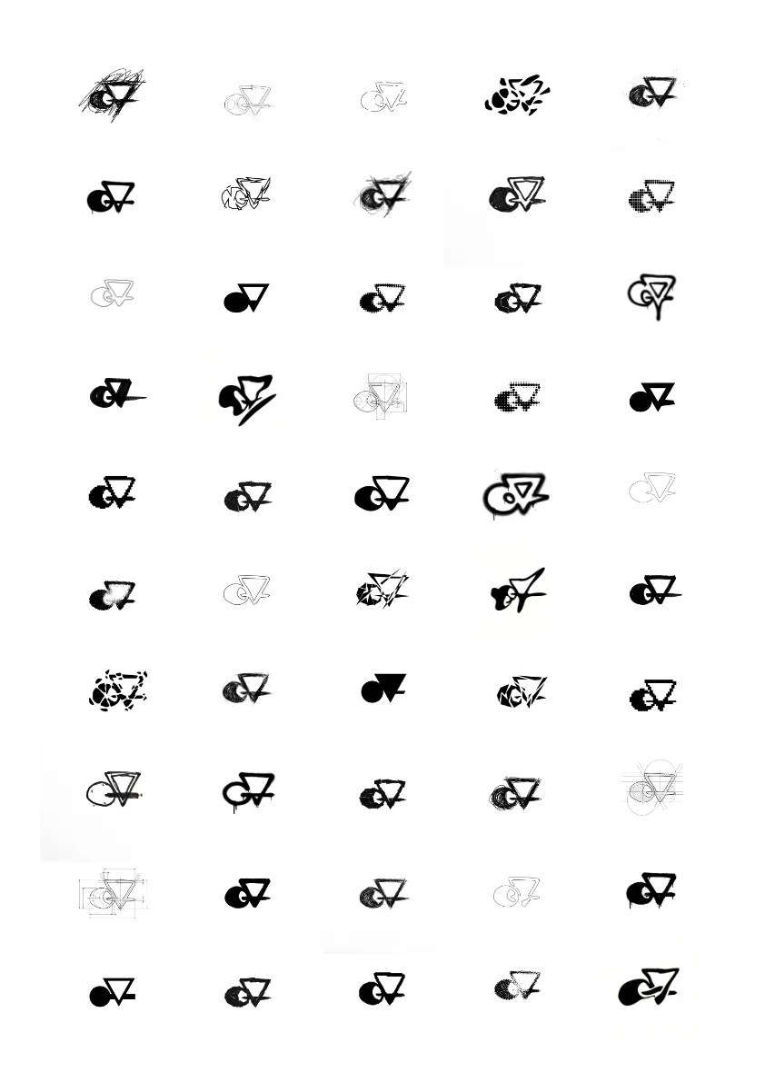
The fourteen variations, from Garabato to Surrealismo, through Wireframes, Puntillismo, or Pixeles, are not isolated experiments. They are a modular system: creative exploration and a real tool so the brand can adapt to different contexts and media without losing its identity.
Merch & Pieces
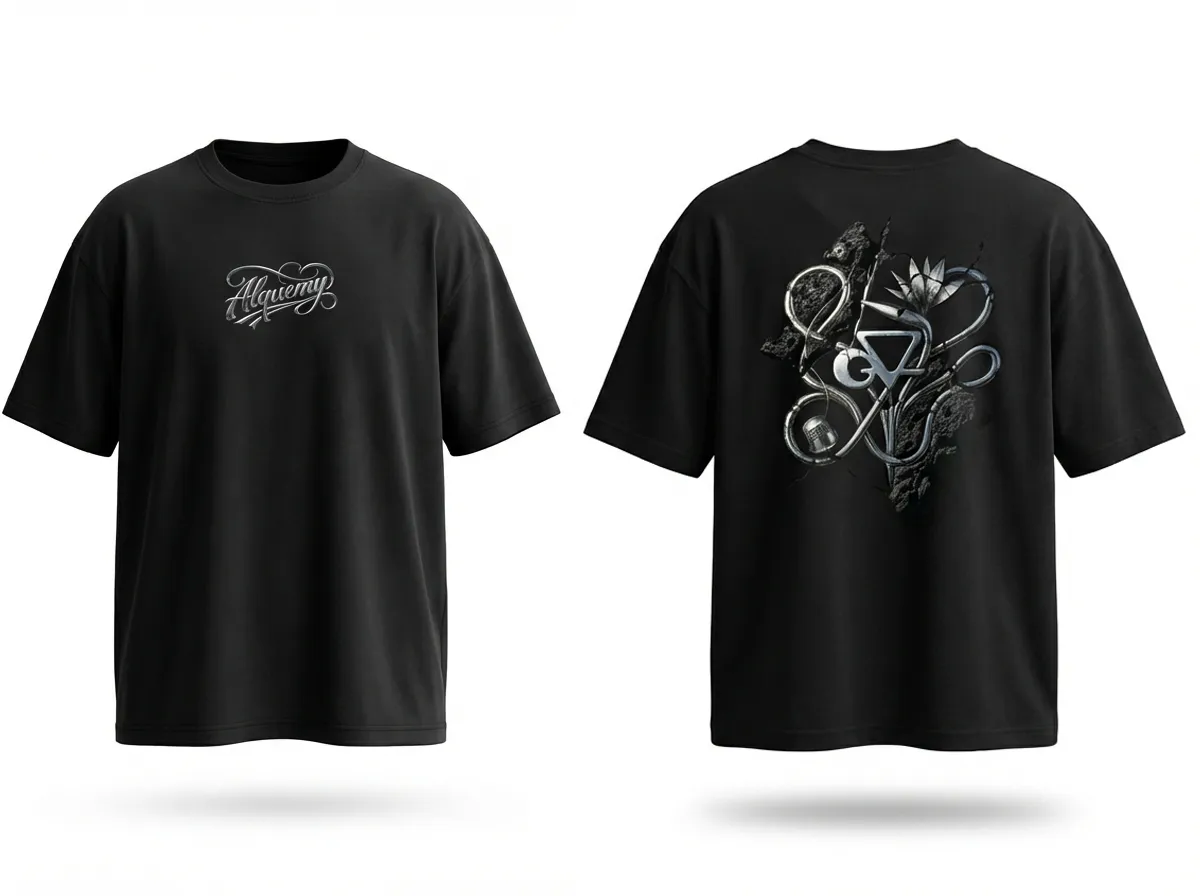
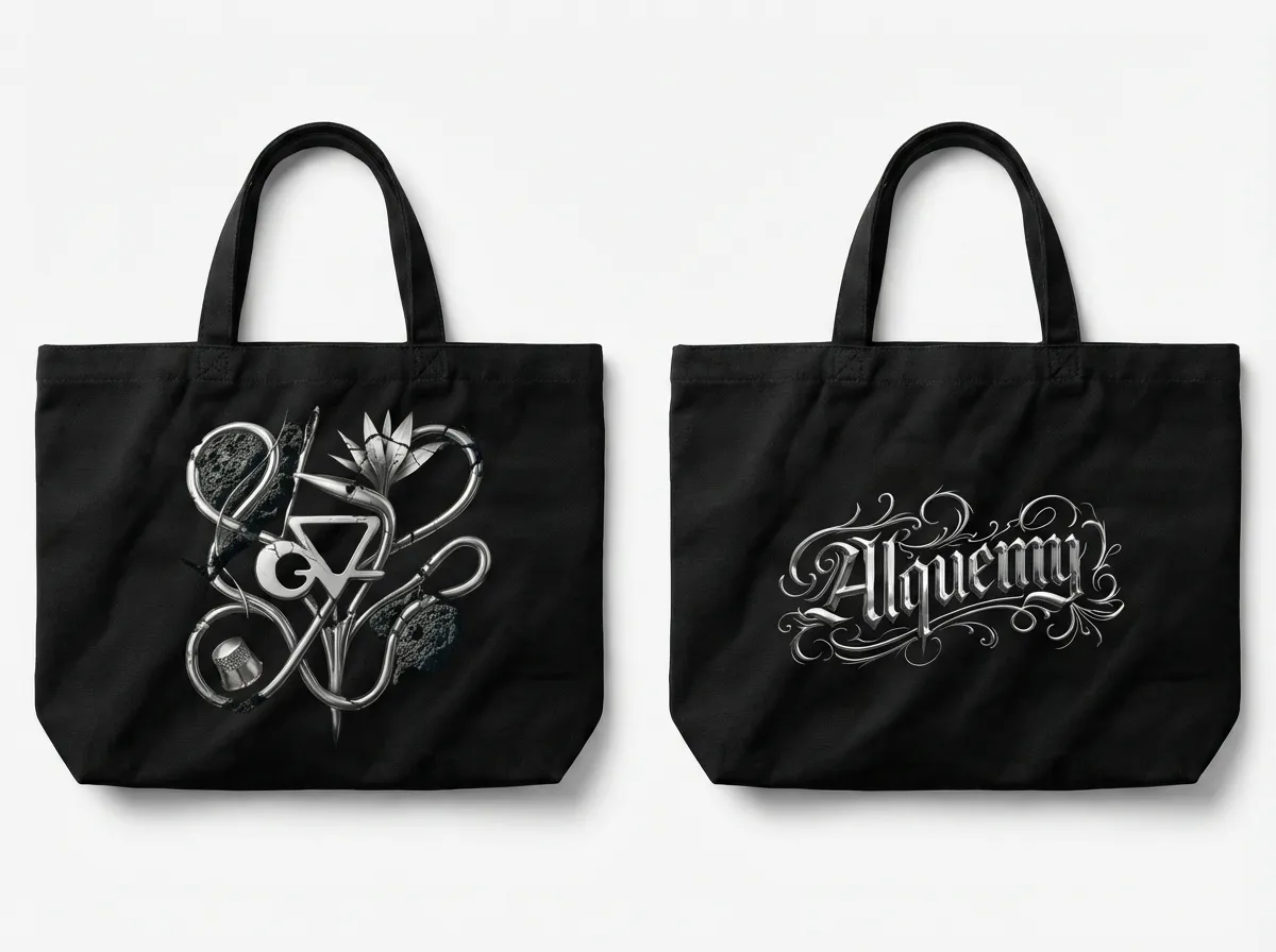
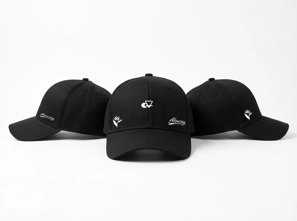
The merch, t-shirt, cap, and bag, is designed with the same logic as the logo: pieces that hold up both within the brand context and outside it. No filler merchandising. Objects someone would actually want to wear.
To close the event's ecosystem, printed pieces such as invitations and business cards were designed for the celebration. Each piece shares the same visual language, dark, precise, metallic and works on its own or as part of the whole.